BASED IN TAURANGA · WORKING WITH BUSINESSES ACROSS NEW ZEALAND & WORLDWIDE
Mai Travel Brand Identity Case Study
A strategic brand identity project demonstrating how thoughtful branding can elevate how a business presents itself and connects with its audience.
Project Overview
This brand identity case study outlines the strategy-led foundations created for Mai Travel from the outset.
Mai Travel was a newly established boutique travel business, created to offer carefully curated, experience-led journeys.
As a new brand entering the market, Mai Travel required more than visual design alone. With no existing imagery, brand assets, or positioning in place, the focus from the outset was on building strong strategic foundations, clarifying who the brand was for, what it stood for, and how it needed to show up with confidence and credibility.
The Starting Point
Mai Travel began as a concept rather than an established brand.
There was:
no existing visual identity
no brand imagery
no clear positioning or messaging
and no defined framework to guide future decisions
The challenge, and opportunity, was to create a brand that felt considered, trustworthy, and refined from day one, while allowing room for the business to evolve and grow.
The Brief
The goal was to develop a strategic brand identity that would:
establish clarity around audience, offering, and positioning
communicate trust and professionalism from the outset
feel calm, refined, and experience-led
support both print and digital touchpoints
provide a strong foundation the brand could grow into
This was not about launching loudly, but about launching well.
A Strategy-Led Foundation
The project began with brand strategy, defining the core elements needed to guide every decision that followed.
Together, we clarified:
who Mai Travel was for
the type of experience being offered
how the brand should be perceived
what needed to be communicated — and what didn’t
This strategic groundwork ensured the brand was built with intention, rather than assumptions, and provided a clear framework for future growth.
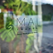
The Brand Identity
With strategy in place, the visual identity was developed to feel calm, confident, and considered.
A refined typographic system and restrained colour palette were chosen to establish credibility and allow future photography and storytelling to take centre stage. The overall identity feels understated yet assured, supporting trust without unnecessary embellishment.
Every element was designed to be flexible, timeless, and easy to apply as the business continues to grow.
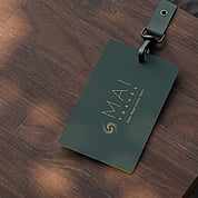
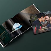
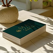
Brand Application & Support
As part of the brand rollout, the identity was thoughtfully applied across key early touchpoints, including:
brand collateral and printed materials
client-facing documents and templates
marketing assets designed to support launch
With no imagery available at the outset, the brand system was designed to stand confidently on its own, ensuring consistency and clarity until photography and content could be introduced over time.
The Outcome
Mai Travel launched with a clear, confident brand foundation, one that feels aligned with the experience being offered and supports the business as it grows.
The brand now provides:
clarity around positioning and audience
confidence in how the business shows up
a cohesive visual identity across touchpoints
a strategic foundation that won’t quickly be outgrown
Rather than feeling rushed or incomplete, the brand feels intentional, credible, and ready.
A Note on Process
This brand identity case study reflects my approach to branding, particularly for businesses at the beginning of their journey.
By starting with strategy and building with intention, new brands can enter the market with confidence, clarity, and cohesion, without needing to rely on trends or excessive visual noise.
Related Work
Explore more strategic brand identity case studies and branding projects in the portfolio for wedding and creative businesses.
Elevate Your Brand.
If you’re starting a new business, or rebuilding from the ground up, strategic branding can provide the clarity and confidence needed to begin well.