(How Strategic Layout Elevated a Wedding Brand’s Positioning)
Wedding Brochure Design Transformation
A wedding brochure isn’t just printed information.
It’s a positioning tool.
When done strategically, it builds trust, communicates value, and reinforces your wedding business branding long before a client signs a contract.
Project Overview
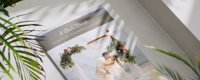
A client approached me for a new wedding brochure design that reflected her elevated service level.
While her visual identity was already strong, the brochure layout she envisaged lacked structure, hierarchy, and the clarity needed to communicate premium positioning.
This is something I see often in established wedding businesses: the brand has evolved, but the collateral hasn’t caught up.
When your business grows, but your materials stay the same, misalignment appears.
The goal was simple:
Create a cohesive, refined brochure layout that aligned with her wedding business branding and attracted higher-value, ready-to-book couples.
The Challenge
The original layout concept did not support her premium positioning.
Key issues included:
Competing elements with no clear visual hierarchy
Insufficient white space
Imagery that didn’t feel intentionally curated
A reading flow that didn’t reflect how couples process information
A structure that flattened the luxury perception of the brand
To attract aligned clients, her brochure needed to:
Create immediate trust
Reinforce brand authority
Reflect the calibre of weddings she wanted to book
This is where many wedding professionals unintentionally weaken their positioning.
The Strategy and Pivot
Strategic wedding business branding isn’t about decoration.
It’s about decision-making.
Key layout decisions included:
Creating intentional sections with breathing room
Establishing a calm, confident reading rhythm
Guiding the eye through hierarchy and spacing
Using typography to reinforce sophistication
Allowing imagery to support, not compete with, messaging
Every choice was grounded in brand strategy, not aesthetics alone.
The Collaboration
I guided the client through the reasoning behind each structural shift.
When clients understand the “why,” confidence increases, and revisions decrease.
That’s a sign of strategic clarity.
This is also why I often recommend starting with a positioning conversation before jumping into design.
If you’re unsure whether your materials reflect your current level, start with clarity.
The Result
The final wedding brochure design felt aligned, refined, and elevated.
It didn’t just look more luxurious.
It felt more intentional.
Her feedback:
“You quickly understood my vision, delivered high-quality work efficiently, and always got it right with minimal revisions needed.”
That reduction in friction is the power of aligned wedding business branding.
When your materials reflect your service level, clients feel it.
And when clients feel it, they enquire with confidence.
The Takeaway
Luxury isn’t defined by decoration.
It’s defined by:
Spacing
Hierarchy
Clarity
Confidence
Intentional restraint
A brochure, pricing guide, or welcome pack should reinforce your positioning, not dilute it.
If your materials feel visually pleasant but strategically flat, you may be experiencing the same quiet misalignment discussed here.
Work With Me
If your wedding brochure, pricing guide, or welcome pack no longer reflects the calibre of weddings you want to attract, it may be time for strategic refinement.
I work with established wedding professionals across New Zealand and worldwide to elevate their brand positioning through intentional design systems and cohesive brand collateral.
Start with a Strategic Clarity Call to explore whether your materials are supporting or limiting your growth.
Written by Amy Brailey
Founder & Strategic Brand Designer, Poppyseed Design
Amy Brailey is a strategic brand designer specialising in wedding business branding and positioning for established wedding professionals across New Zealand.